|
 |
Welcome to issue 81!
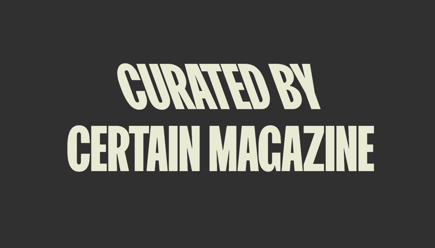
Today’s issue was guest curated by our friend Filippos Fragkogiannis. Based in Athens, Greece, Filippos works as a freelance designer and art director. He also runs Certain Magazine, an independent curatorial platform on Instagram, where he shares handpicked design projects from around the world since 2018. Here are his top picks of recent font releases. Enjoy!  Noemi Noemi |
|
Font Family of the MonthEVERY MONTH, OUR MEMBERS RECEIVE A PERPETUAL LICENSE TO USE A NEW FONT FAMILY — EVEN AFTER THEY CANCEL THEIR MEMBERSHIP. |
 |
 |
|
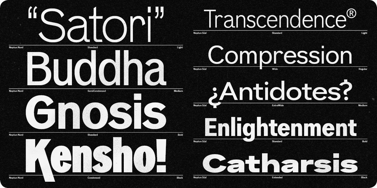
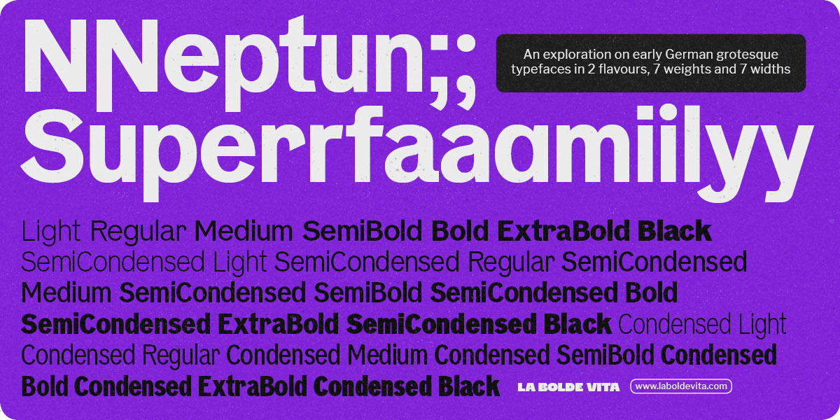
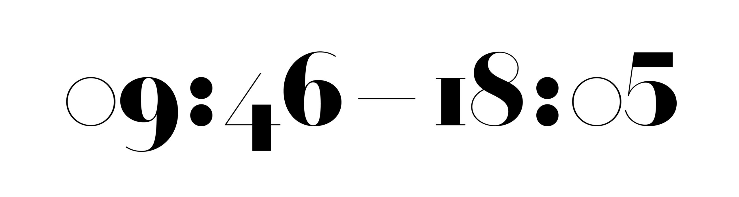
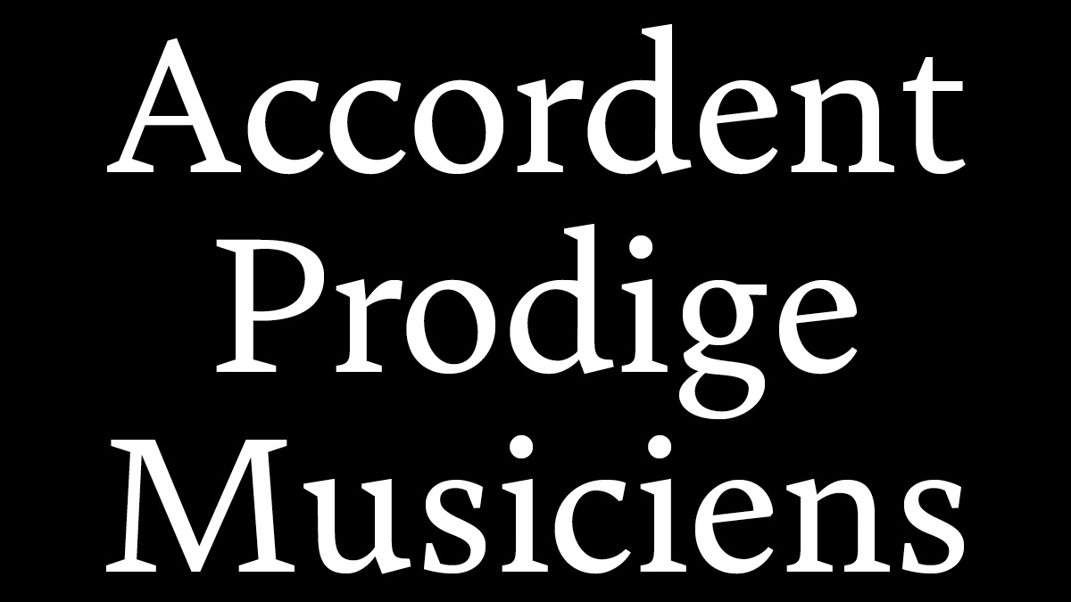
Our font family of November, Neptun, is a warm and playful typeface packed with personality and up-to-date usability. Designed by Fabian Dornhecker, it comes in two subfamilies: Neptun Nord, with pointed terminals and narrow widths, and Neptun Süd, with wider proportions. Each subfamily comes in seven weights, from Light to Black, in a comprehensive range of widths, with various stylistic sets. Become a member this month and get a perpetual license that includes: - Neptun Nord (7 weights x 3 widths, plus a variable font)
- Use in personal and commercial projects
- Desktop use on up to 2 computers
- Web use on one website, not exceeding 5k unique monthly visitors
|
|
|
From Partner Foundries |
 |
 |
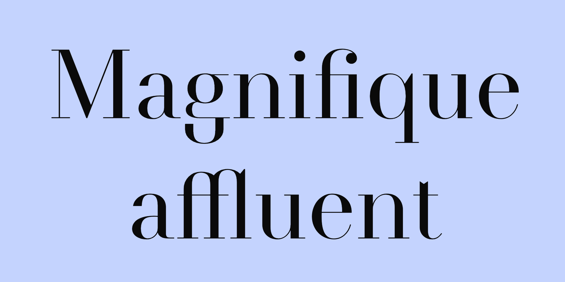
Didot Modern by Arnaud Chemin |
|
|
What an exquisite release from Nouvelle Noire. Designer Arnaud Chemin describes it like this: “Didot Modern is an experiment on modernizing high contrast letterforms, giving them a more mechanical look.” If you’re like me, you got hooked by the numerals or the amazing lowercase ‘g’ already, but make sure to have a look at its italic counterpart, too 😏 |
|
|
Fresh Releases |
 |
 |
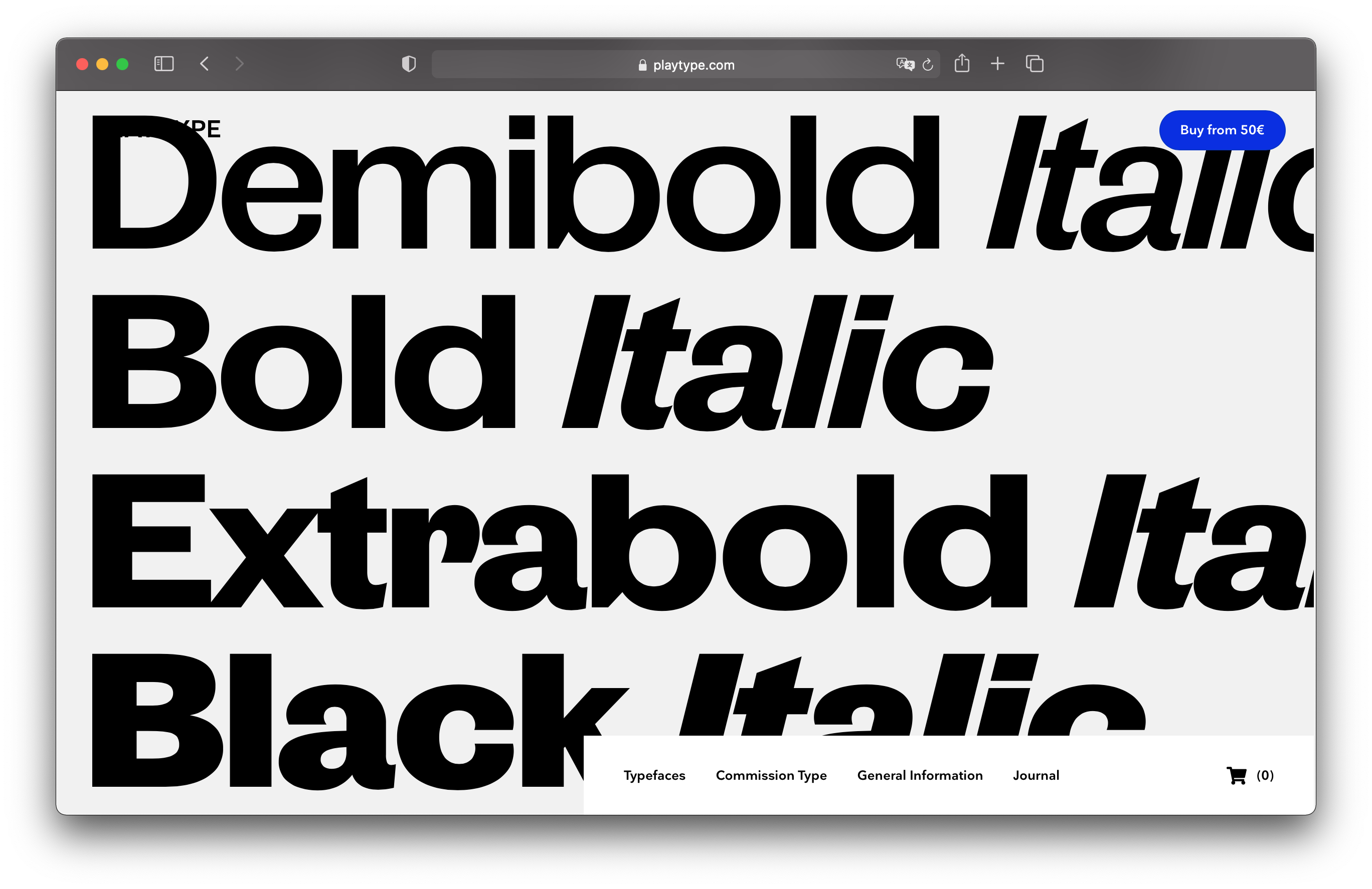
Publish Gothic by Jonas Hecksher |
|
|
I’m glad Filippos picked this one, because I had my eyes on it too! The latest from Danish type foundry Playtype, Publish Gothic, is a contemporary sans serif that maintained the quirks and charm of its predecessors from the 19th century. It is also a large family divided into three widths (condensed, normal and expanded) with italics that are just delightful. |
|
|
 |
 |
|
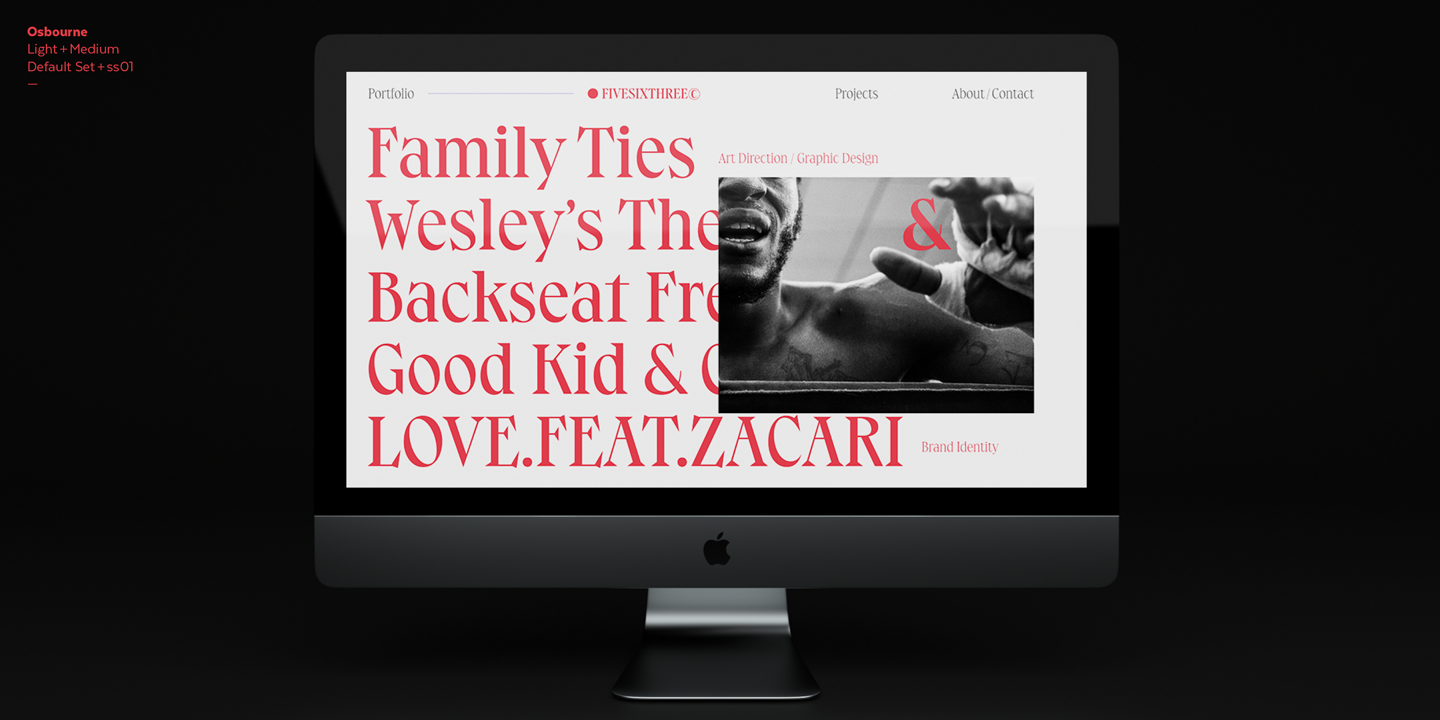
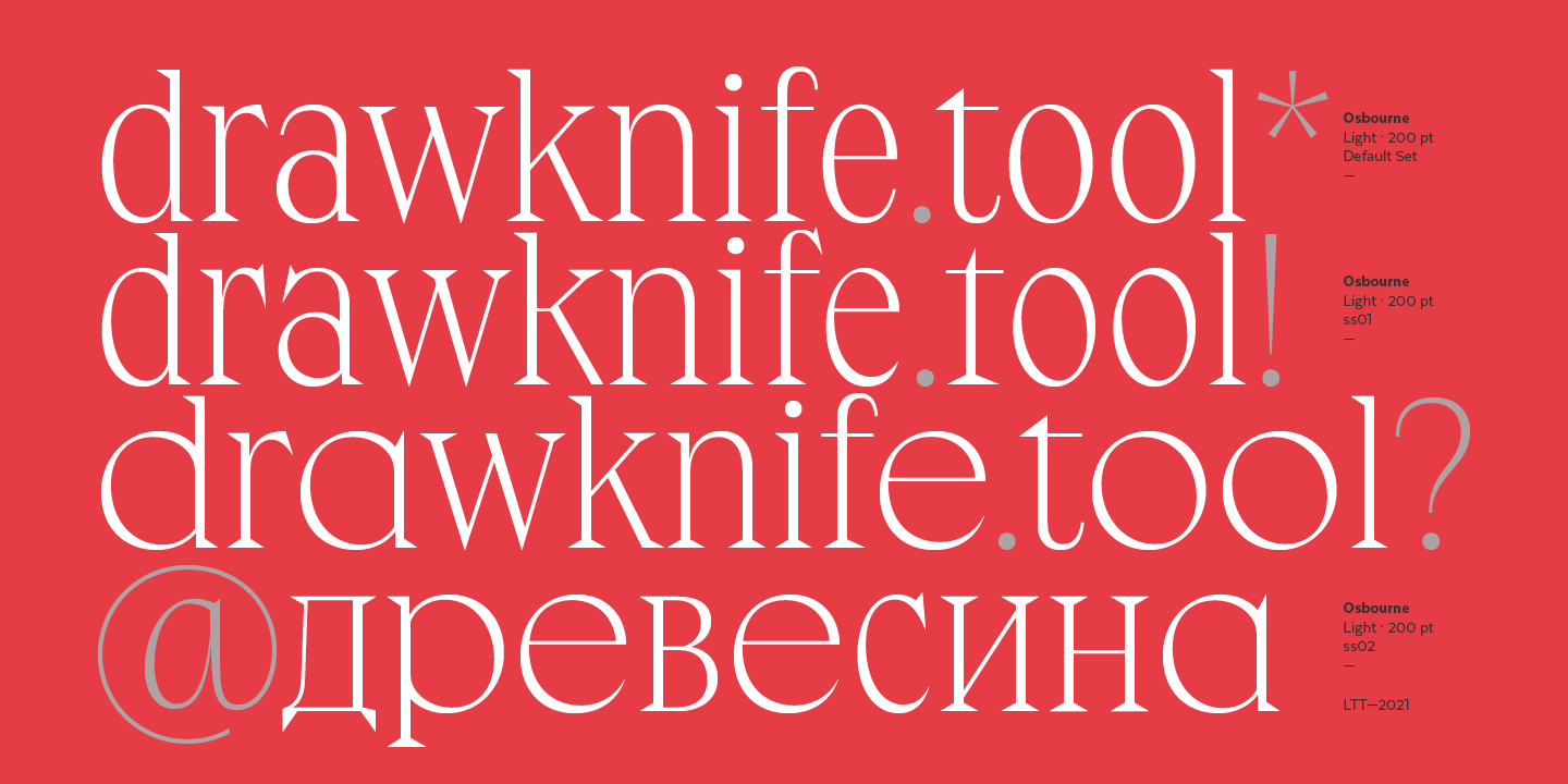
The latest from Latinotype, Osbourne, makes a very interesting use of stylistic sets. Notice how stylistic set 03 replaces some letters with an alternate that was extended (like the ‘o’ or the ‘e’), combining them with letters that didn’t change in width — and still creating a cohesive whole. Filippos’ favorite weight is Osbourne 03 Black, and I’ll have to agree with him that it is my favorite subfamily, too. |
| |
 |
 |
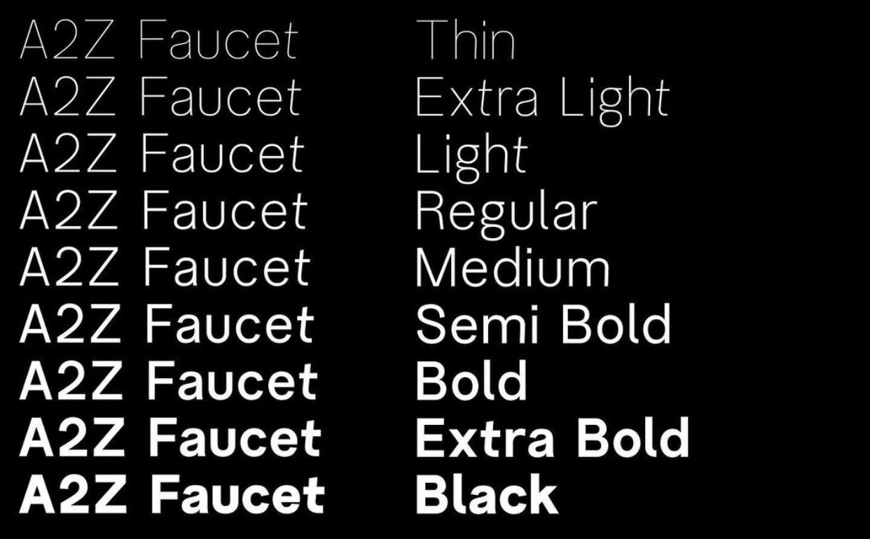
A2Z Faucet by Daniel Schriër |
|
|
I’m pretty sure Montreal-based Daniel Schriër had fun while designing this one. Faucet, his third retail font, is a typeface packed with alternate characters — most of them tilted, and not always in the same direction. This creates a refreshing impression of movement, which can be accentuated even more by using its loopy alternates (like the ‘s’ or ‘k’). |
| |
 |
 |
|
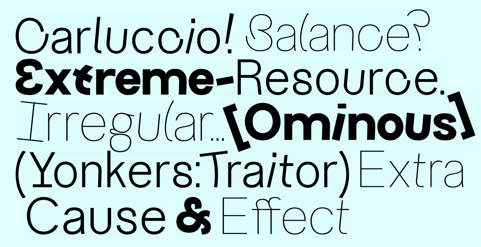
Designed by Sarah Kremer, Bartok is a small family of four styles, each with a singular design—some of them serifs, some of them sans serifs. Bartok Regular, for example, is a charming serif with asymmetrical details, which pairs well with Bartok Poster, a display style with irregularities of alignment and varying angles. |
| |
 |
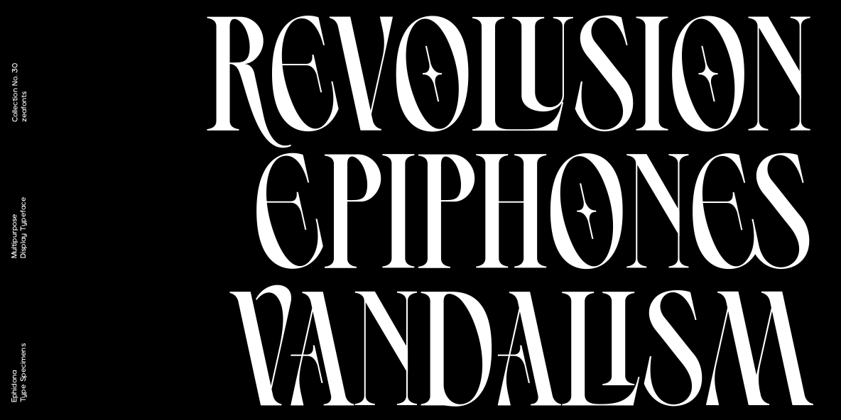 |
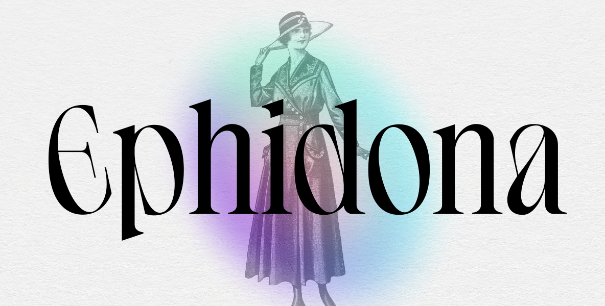
Ephidona by Bagerich Type |
|
|
Ephidona is the work of Bagerich Type, an independent type foundry based in Indonesia. Co-founded by designers Reza Rasenda and Riska Chandra Dewi, the foundry focuses on display typefaces. As such, Ephidona is intended for use at large sizes. And its wide range of ligatures makes this high-contrast serif even more fun to look at. |
| |
In case you missed it |
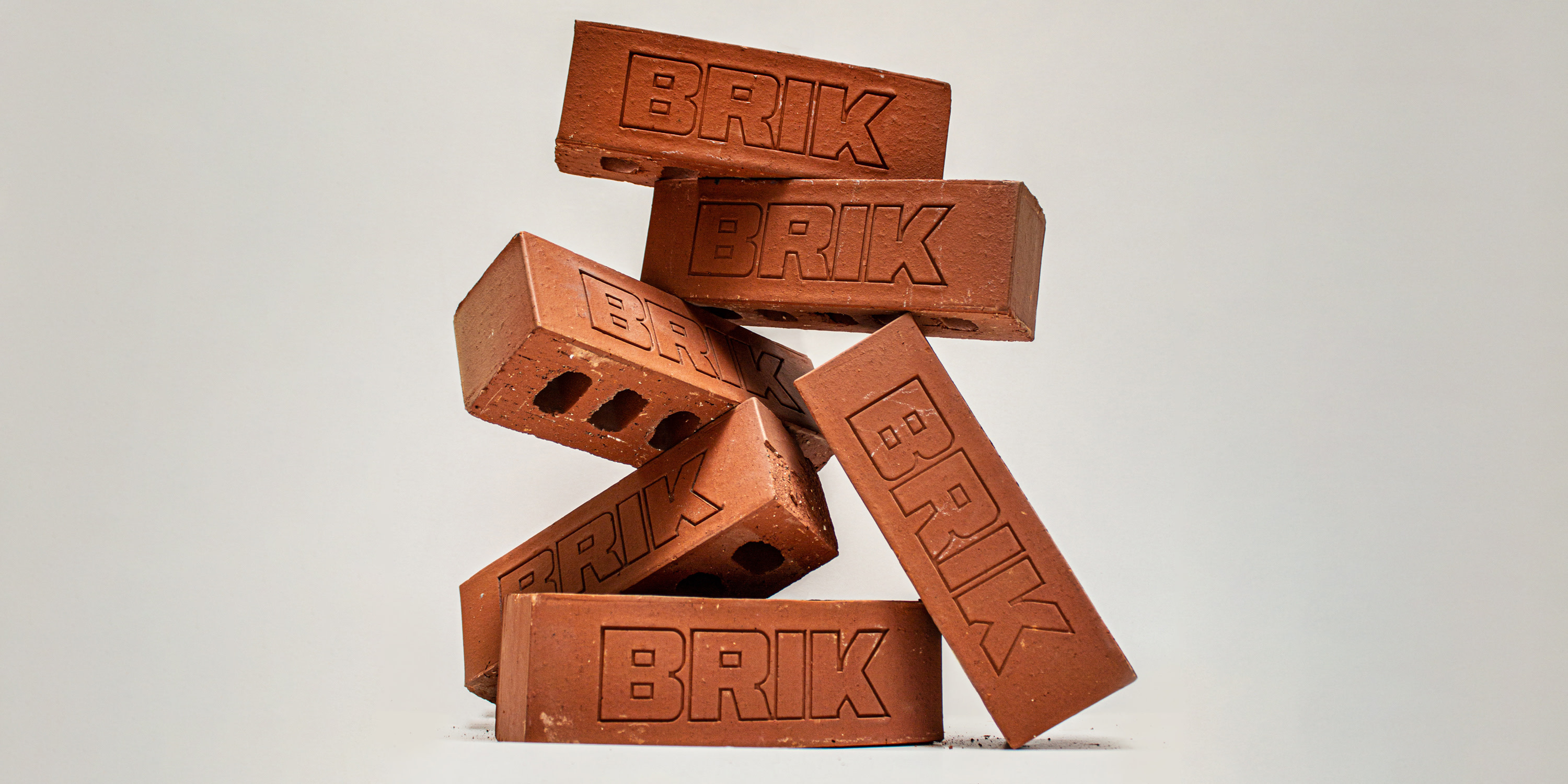 BurnType’s Brik typeface is now available in 20 styles, with variable font support. |
|
↗︎
| Clinker, by Mickaël Emile, is an experimental font with potential use in 3D environments. |
|
↗︎
| A ‘wax’ style was added to Matteo Bettini’s Hidde Grotesk. |
|
|
Goods |
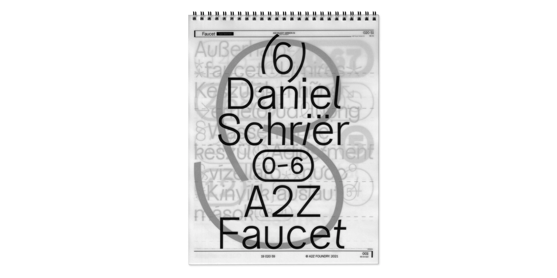 What a cool type specimen for A2Z Faucet. Printed on demand on vellum paper. | 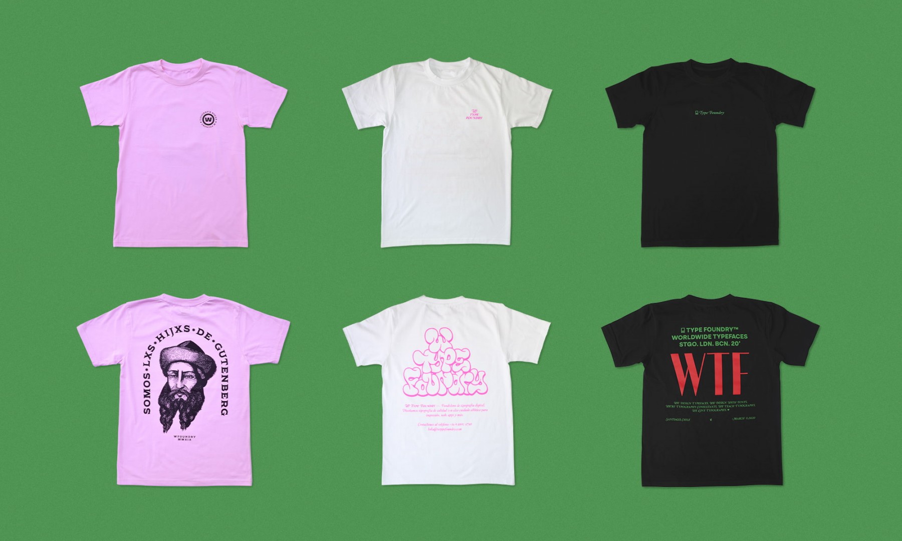 We like these t-shirts by W Type Foundry. |
|
Build your font collection
Every month, our members receive a commercial license to use a new, handpicked font family in print and on screen. And they own the license for life, even after they cancel their membership. Don’t miss out on more font goodness, support Fresh Fonts and become a member today!
For only
$14.99/mo
|
|
|
|
Fresh Fonts is curated by Noemi Stauffer and Christophe Bouche, two creatives who are passionate about independent type design. How would you rate today’s newsletter?
Great | Good | Meh
|
|
|
|