|
 |
Welcome back!
It’s only November but this year has already seen the apparition of several new foundries created by incredibly talented type designers. Here are our favourites. Enjoy!  Noemi Noemi |
|
Font Family of the MonthMEMBERS RECEIVE A NEW FONT FAMILY EVERY MONTH TO USE IN THEIR PERSONAL AND COMMERCIAL PROJECTS. AND THEY CAN USE IT FOREVER. |
 |
 |
|
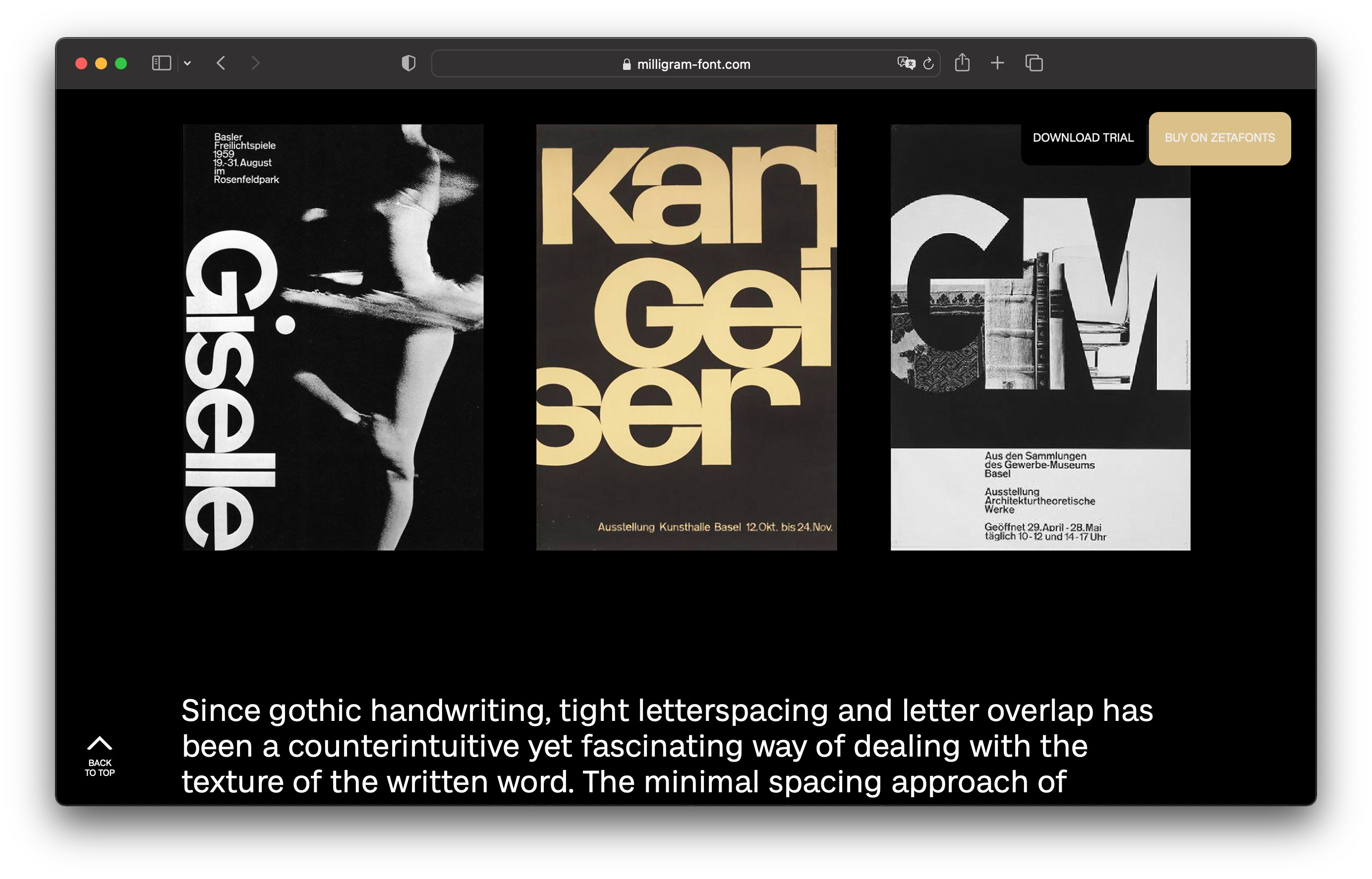
Designed by Cosimo Lorenzo Pancini and Andrea Tartarelli, Milligram includes three subfamilies, of which two are intended for display use. First, Milligram Regular (or “Milligram Roman”) is a display family in seven weights with italics, ready for use in titling, headlines and logos. Next comes Milligram Macro, thought for logo design and extra-large titling, featuring tight spacing in its lighter weights, and even negative letter spacing in its heavier weights. Lastly, the superfamily is completed by a Text version. Milligram comes with support for Latin and Cyrillic, and a two-axis variable font (weight and optical size). Become a member this month and get a perpetual license that includes:
- The complete Milligram superfamily (36 font styles + variable font)
- Use in personal and commercial projects
- Desktop use for one user (you)
- Web use on one domain (not transferable to clients)
Plus, you can cancel your membership anytime. |
|
|
New Type Foundries |
 |
 |
|
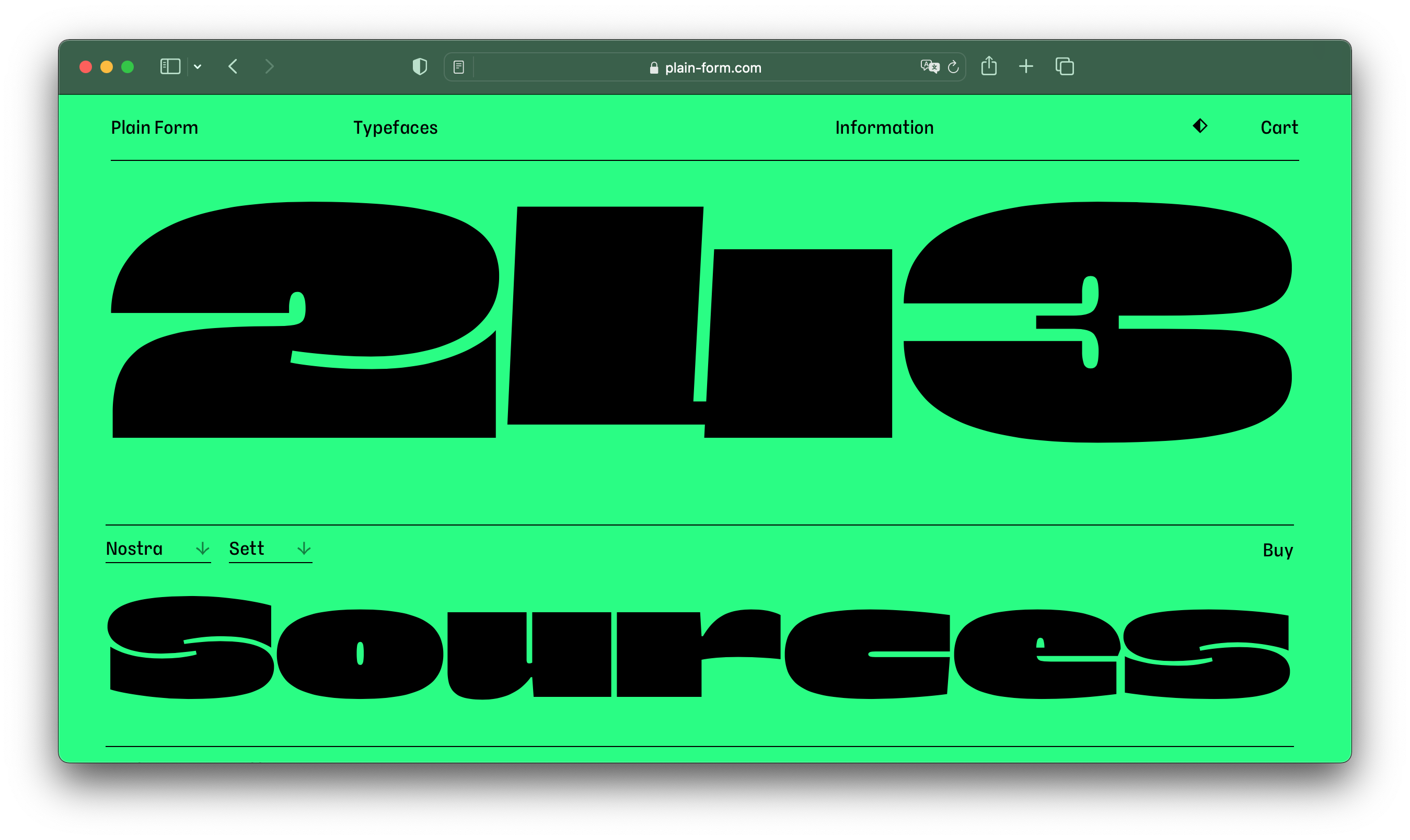
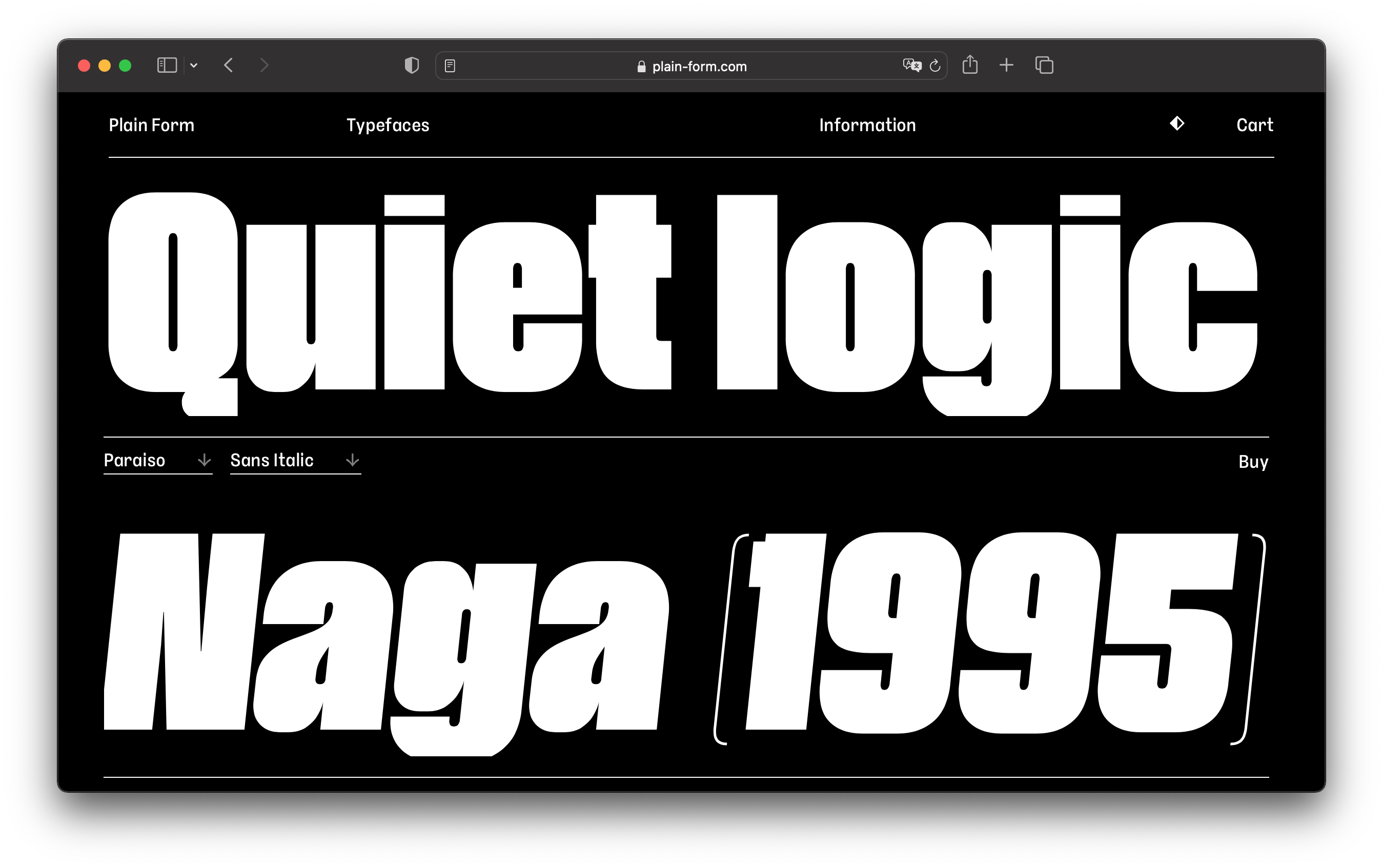
Lucas Descroix (author of Syne, one of my favourite open-source typefaces) finally has his own font shop! There you will find two typefaces freshly graduated from Future Fonts: Paraiso, a condensed display face with hairline punctuation, and Nostra, an extra-wide monospace display family of which the two font styles couldn’t differ more (while the roman is blocky and chubby, the italic is light and curvy). But there are also brand new faces to discover: Petit Frère, Ready, and Disc (this one only available on Future Fonts). |
|
|
 |
|
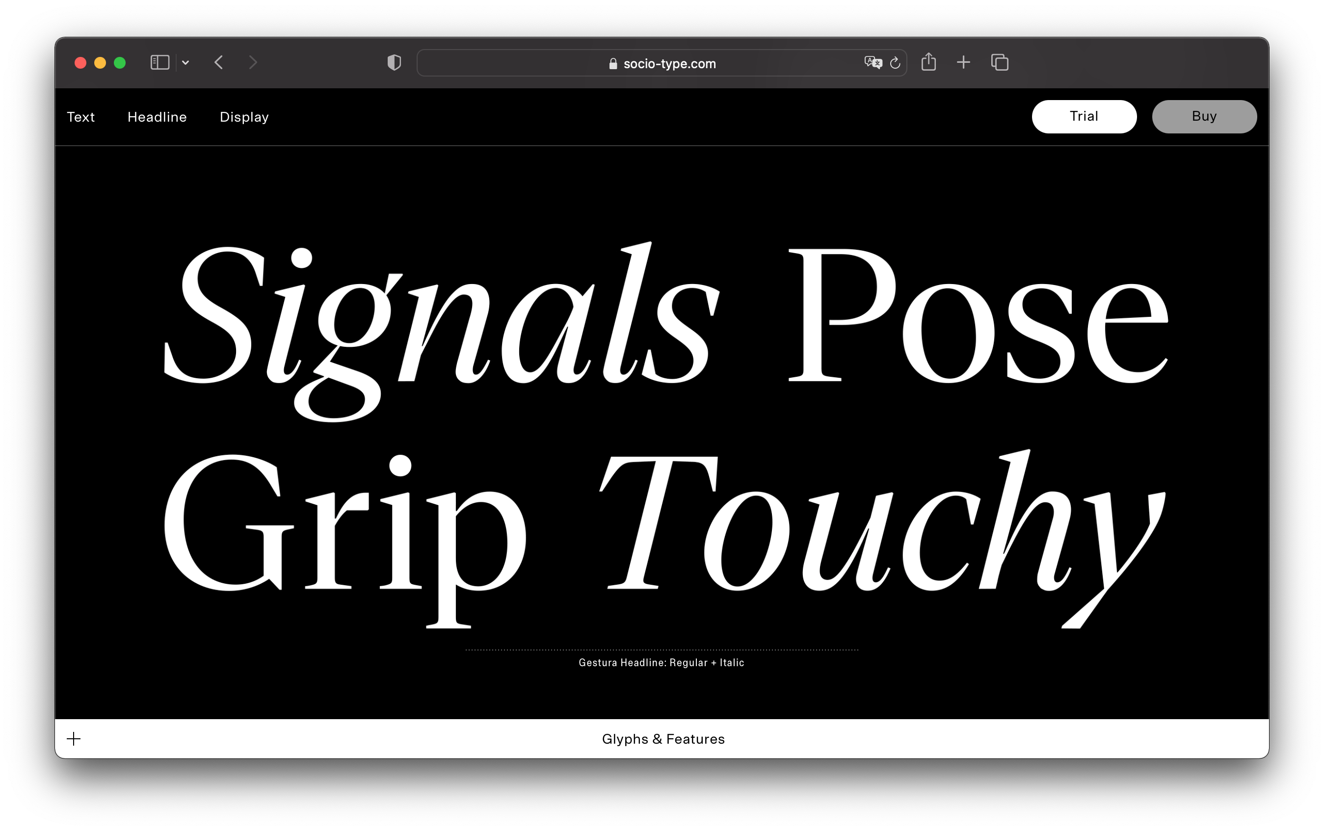
Sociotype is the new type practice of London-based creative studio Socio. At the moment, the foundry counts two superfamilies in its library. First, Gestura is a modern serif featuring contradictory characteristics — its graceful curves abruptly meet hard-edged, wedge-like terminals. With three optical sizes and six delightful stylistic sets to choose from, Gestura offers uncommon versatility. But make sure to have a look at Rework, the foundry’s sans serif workhorse, designed to perform at even the smallest scale, thanks to its Micro subfamily. |
| |
 |
 |
|
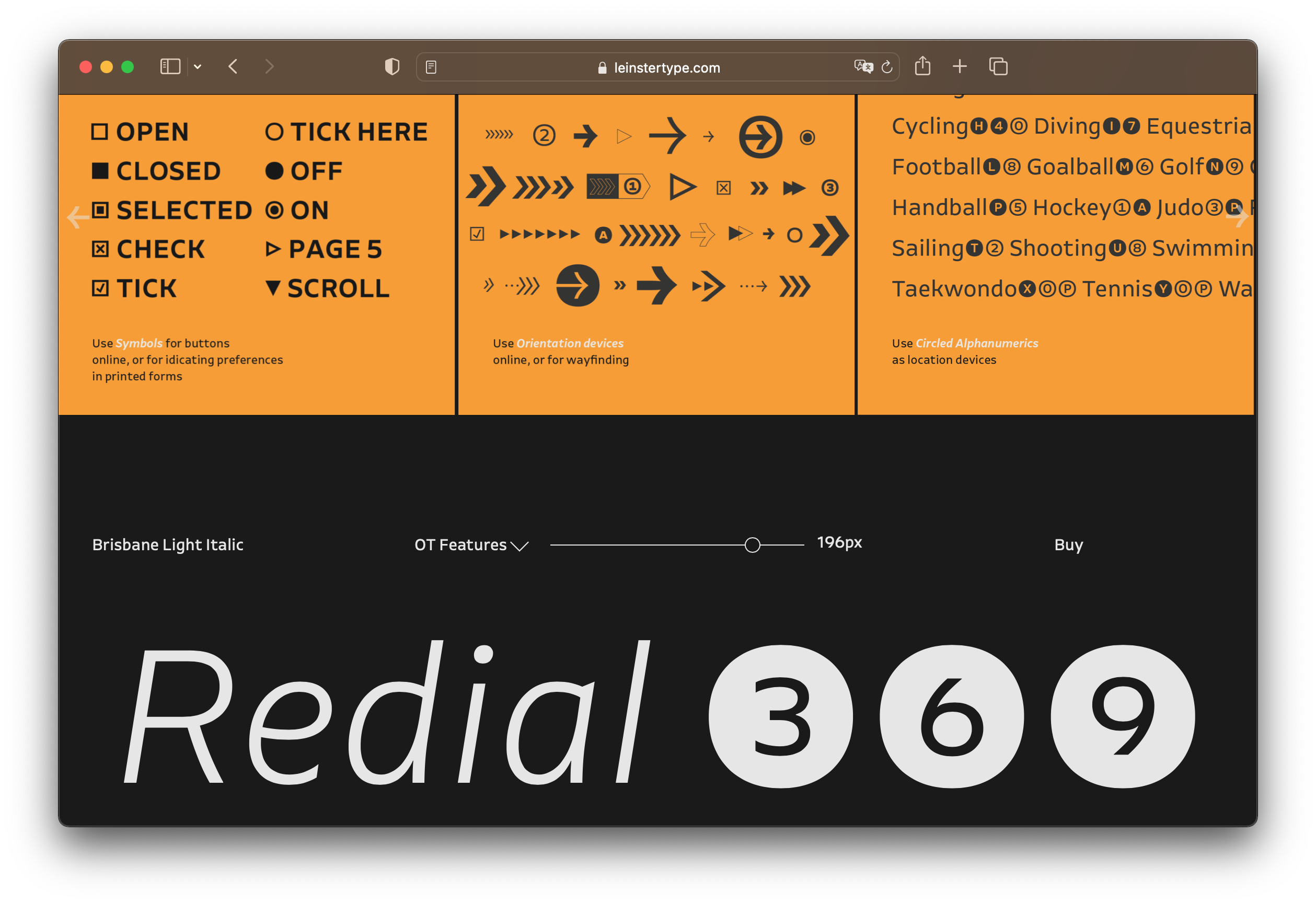
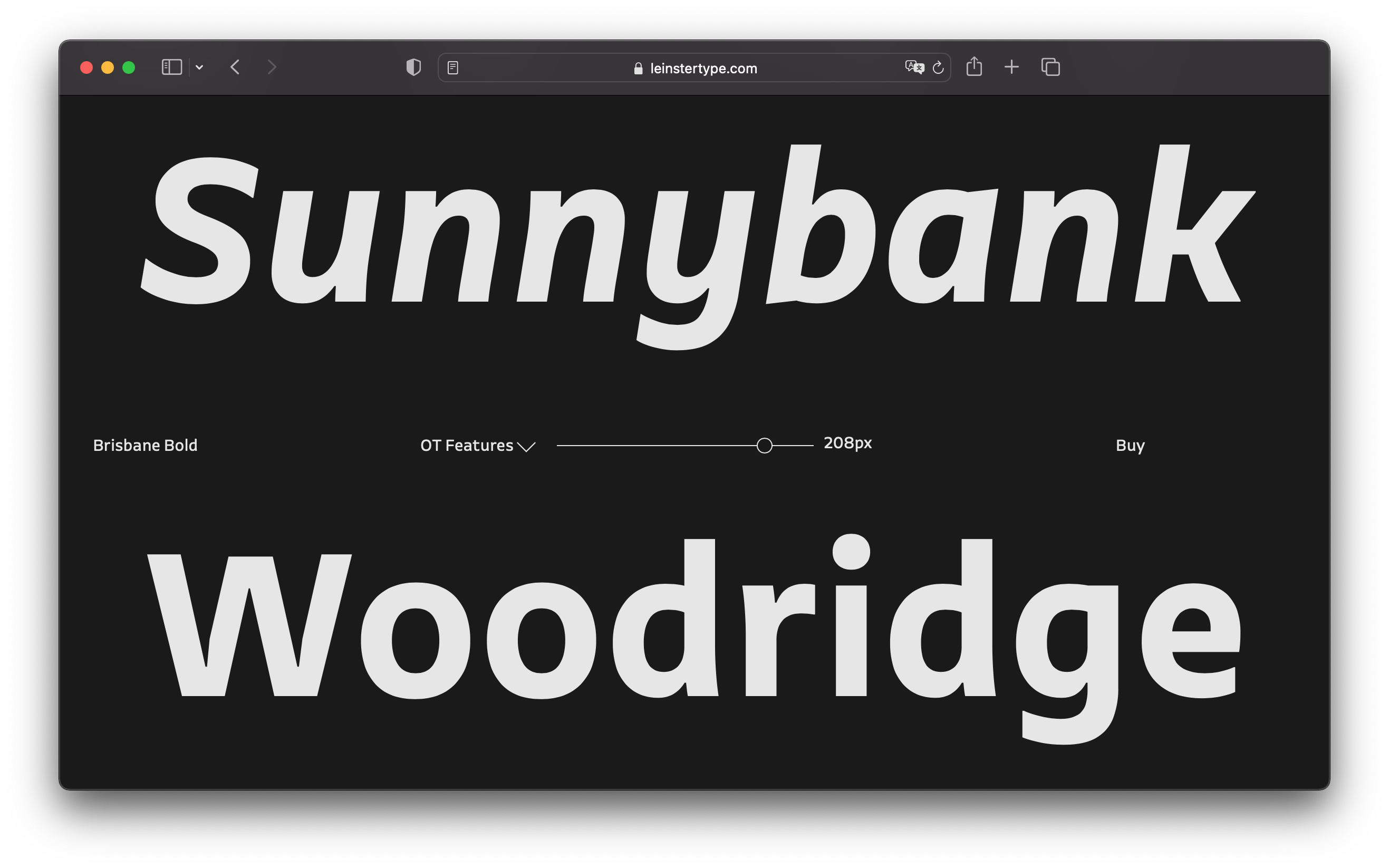
New York-based designer Troy Leinster launched his own foundry last week, after departing Hoefler&Co one year ago. During his seven years at Hoefler&Co, Troy contributed to some of the foundry’s most impressive work, including Ringside, Peristyle, and Decimal. Brisbane, the first typeface released under his new label, is inspired by — and named after — his hometown in Australia. Brisbane is a beautiful humanist sans serif that is perfectly suited for signage and wayfinding deployments, but also long-form copy. |
| |
 |
 |
|
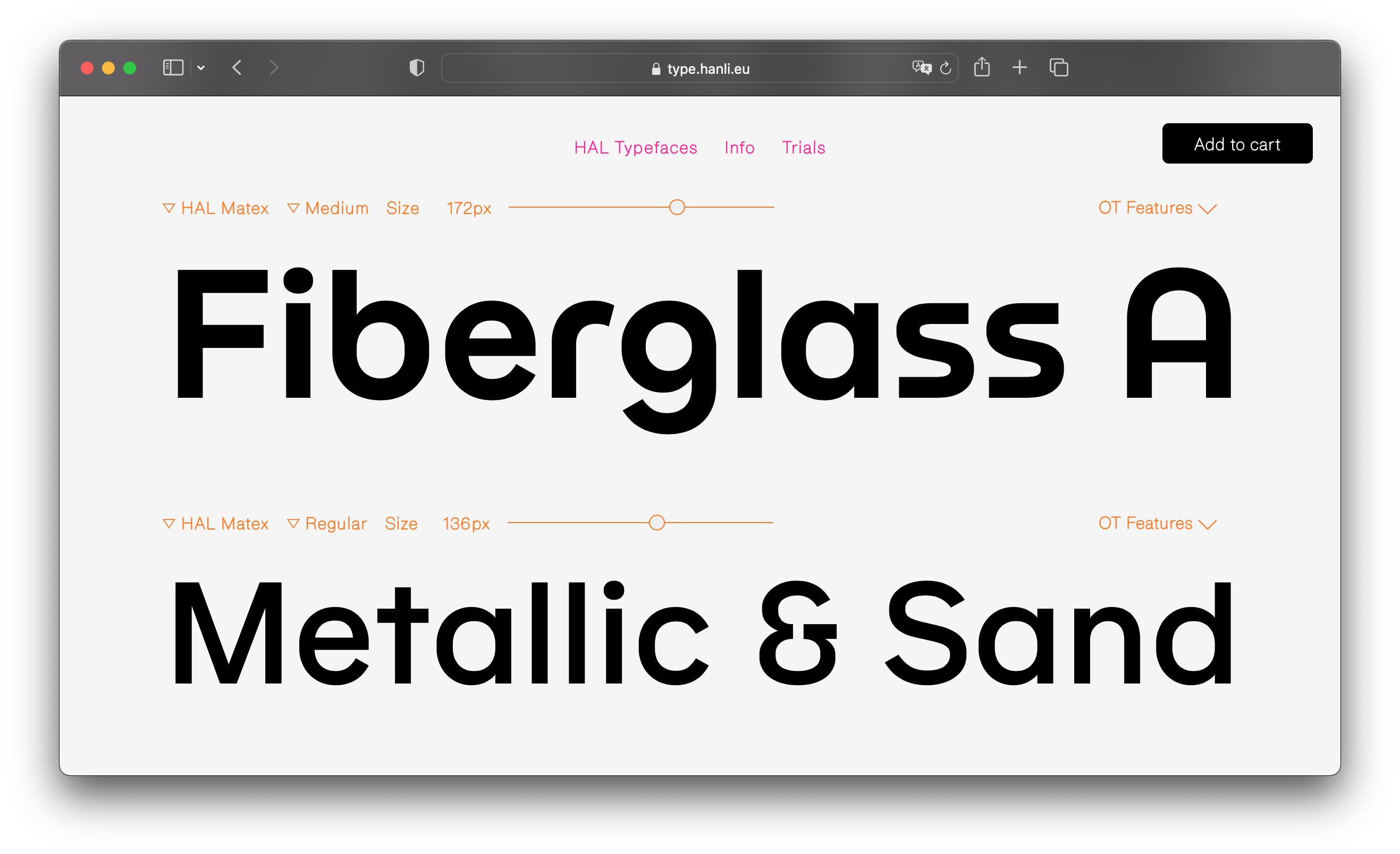
Berlin-based graphic design studio Hanzer Liccini, formed in 2018 by Elias Hanzer and Lucas Liccini, recently launched HAL Typefaces, a platform on which the creative duo sells its font creations. Five typefaces are currently available on their website, including Matex, a clean sans-serif with numerous alternates reminiscent of the geometric bauhaus aesthetic. My personal favourite, however, has to be Timezone, a sturdy text serif in a single weight, with a matching italic style that has a dynamic, lively swing to it. |
| |
 |
 |
|
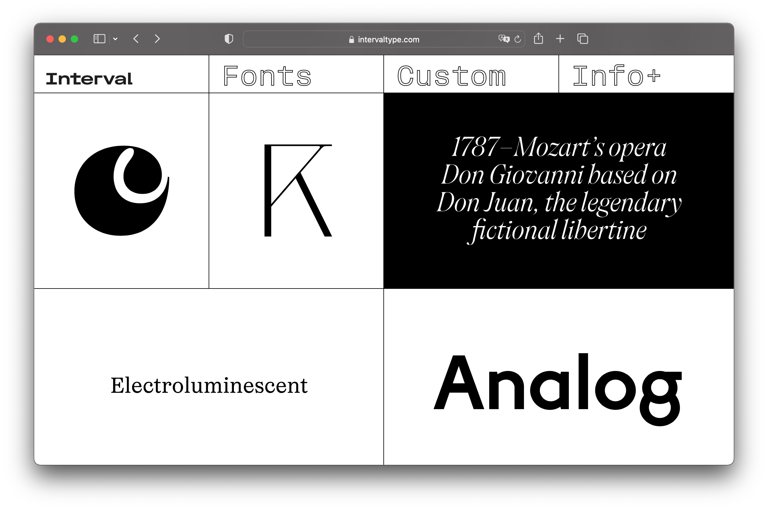
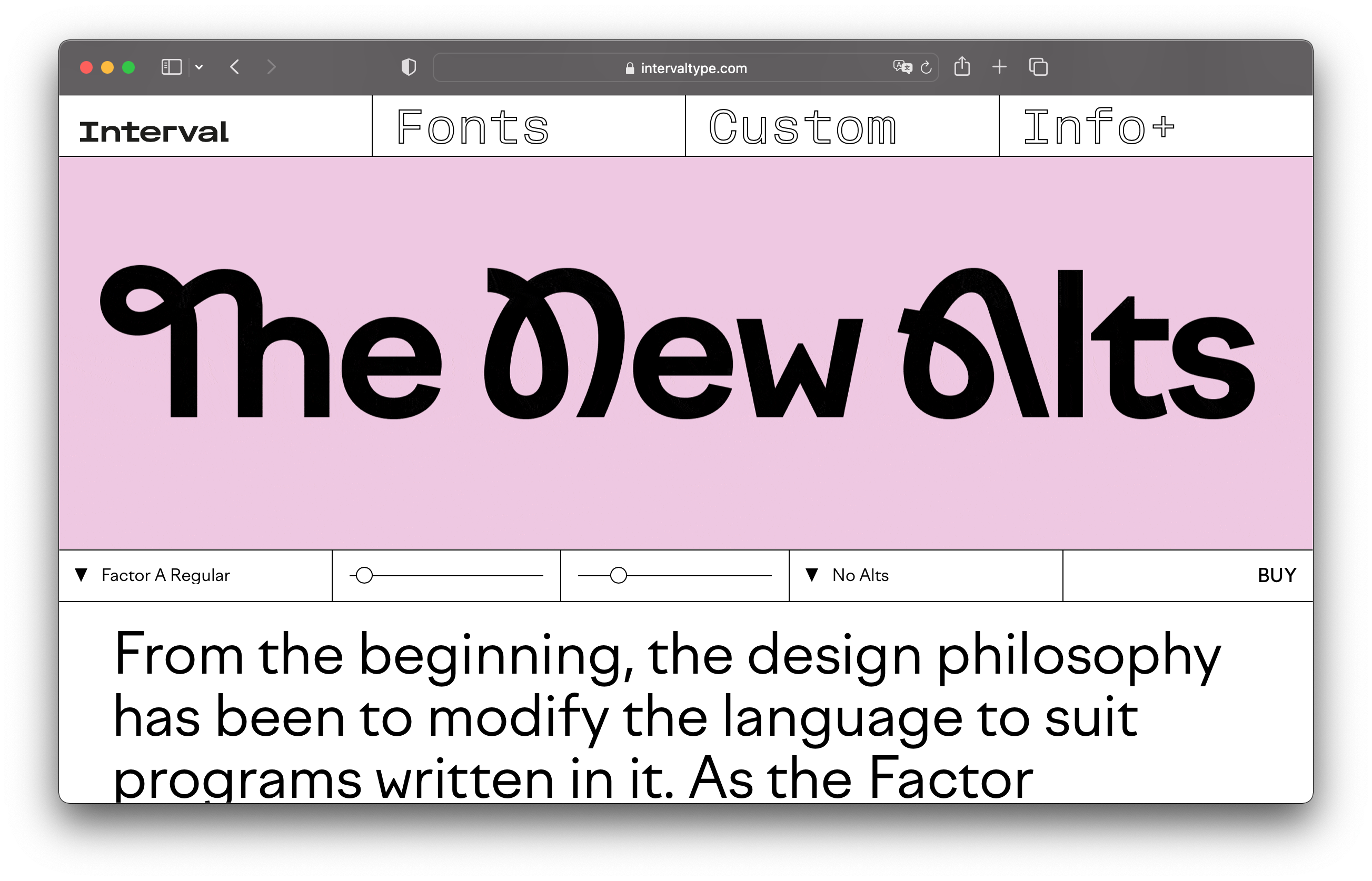
Interval Type is the impressive new foundry of Ilya Naumoff, a Russian art director and type designer now established in Paris, whose work you might have already seen on type.today (or in this newsletter, for that matter, as I’m a big fan). On the foundry’s website, you will find all his typographical work — some already published, some new, like Factor B, the new sister family of Factor A. It’s also your go-to foundry for Cyrillic fonts, since every typeface in the Interval Type catalogue comes with support for both Latin and Cyrillic, with the exception of Englisch. |
| |
 |
 |
|
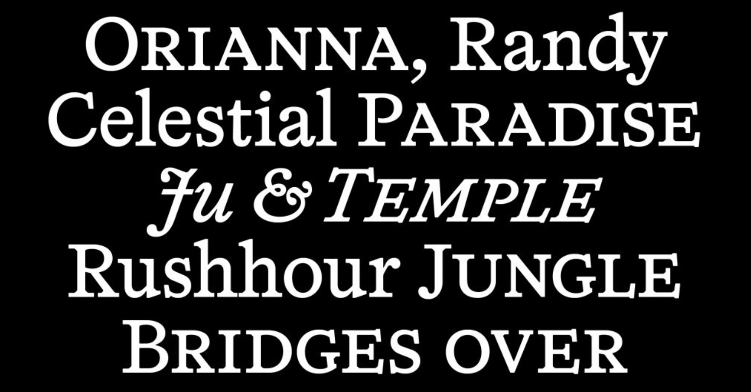
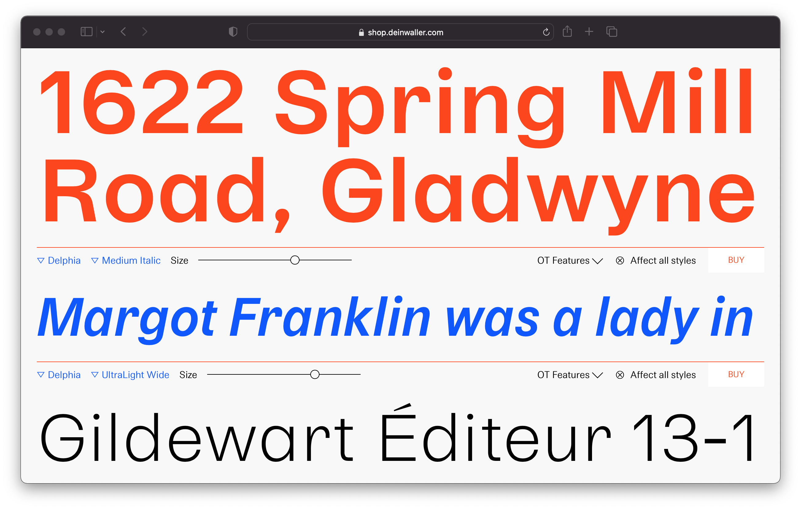
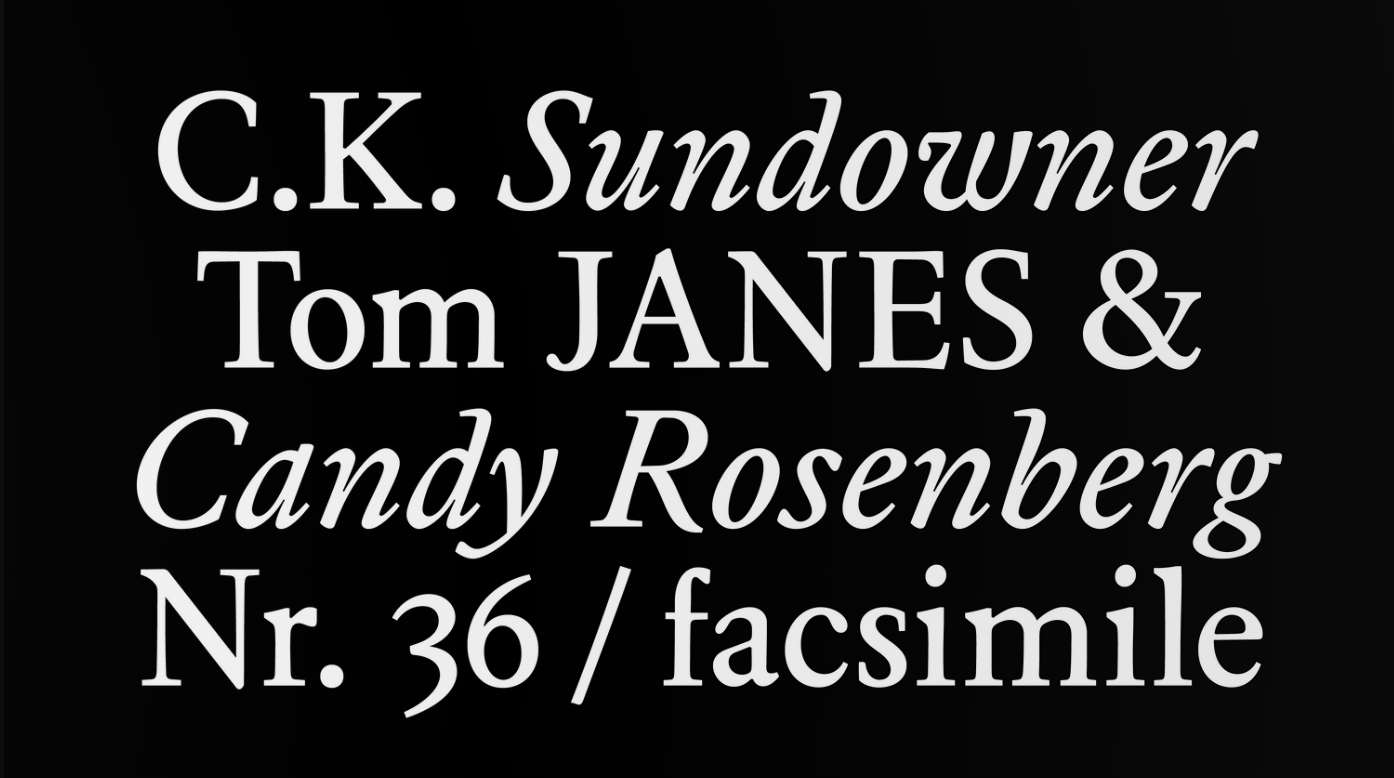
David Einwaller now has an online shop, meaning that you can finally license his fonts directly from him, and fully support his work. I’m not sure if this qualifies as a “new foundry” but I just find his typefaces so good, I couldn’t resist the urge to include him in this list. Eight typefaces are currently available to try and buy on his website, of which my personal favourites are Delphia and Bolivia. While you’re here, make sure to catch a glimpse of Elaphus (pictured above) an unreleased serif typeface that is available upon request. |
| |
Download fresh font families
As a member, you’ll get a license every month to use a complete new font family — handpicked by us. All licenses cover desktop and web use, in both personal and commercial projects. And you’ll have the rights to use the fonts forever, even after you cancel your membership. Plus, you can cancel your membership anytime.
For only
$14.99/mo
|
|
|
Experimental Typeface |
 |
|
The design of Cobra started when Lineto’s co-founder Cornel Windlin decided to expand the logotype of the British sportswear chain of the same name to a full alphabet — which was included in Lineto’s first online font catalogue back in 1998. Type designer Samara Keller proposed to bring Cobra back to life in the age of variable fonts, and with some help, developed a full glyph set to comply with today’s standards. The outcome is an impressive variable font with an “unlimited range of black-and-white ratios.” |
|
|
Goods |
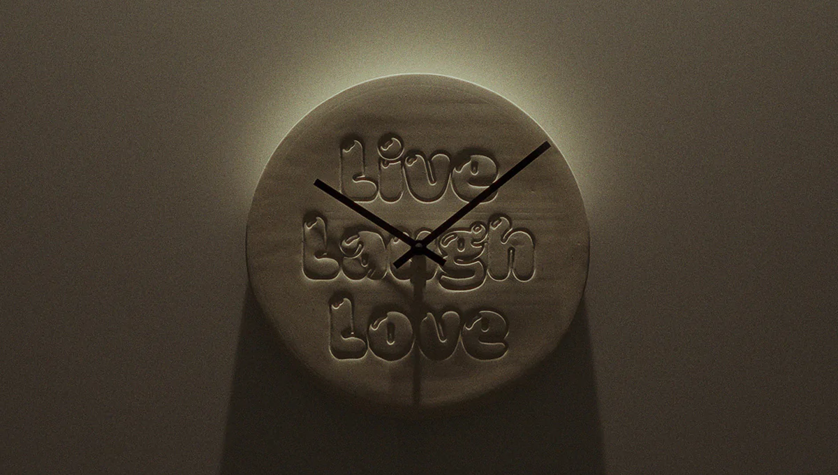 TYPE O’CLOCK is a series of limited edition wall clocks created in collaboration with type designers (pictured above is Grilli Type’s version, typeset in GT Maru Mega). Each clock is handmade in small batches in a ceramic studio in Düsseldorf, Germany. | 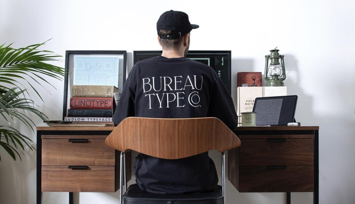 I love these t-shirts by Bureau Berger, typeset in their BTC CAST 01 typeface. Available in a limited edition, the shirts were made with great attention to details, including custom woven labels and custom hang tags. |
|
|
Fresh Fonts is curated by Noemi Stauffer and Christophe Bouche, two creatives who are passionate about independent type design. How would you rate this month’s newsletter?
Great | Good | Meh
|
|
|
|